
Beyond Meat Brand Update
A single plant-based jerky packaging design sprint evolved into a comprehensive design system for Beyond, the global leader in plant-based meat substitutes. The project aimed to enhance consistency, clarity, and overall brand awareness with non-invasive yet impactful design changes, reflecting a shared passion for shaping our collective future.
A single plant-based jerky packaging design sprint evolved into a comprehensive design system for Beyond, the global leader in plant-based meat substitutes. The project aimed to enhance consistency, clarity, and overall brand awareness with non-invasive yet impactful design changes, reflecting a shared passion for shaping our collective future.
Services
Branding
Package Design
Art Direction
Copywriting
Agency Lead
Falkon
Project Lead
Dexton Deboree
Creative Director
Serge Kirsanov
Design Director
Greg Fisk
Art Director
Yuju Yeo
Senior Designer
Shoshana Schultz
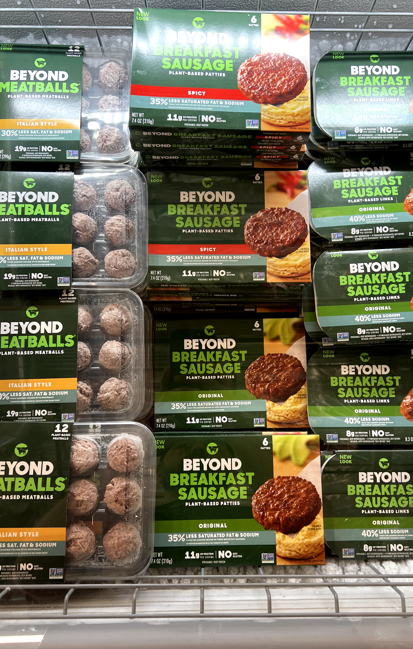
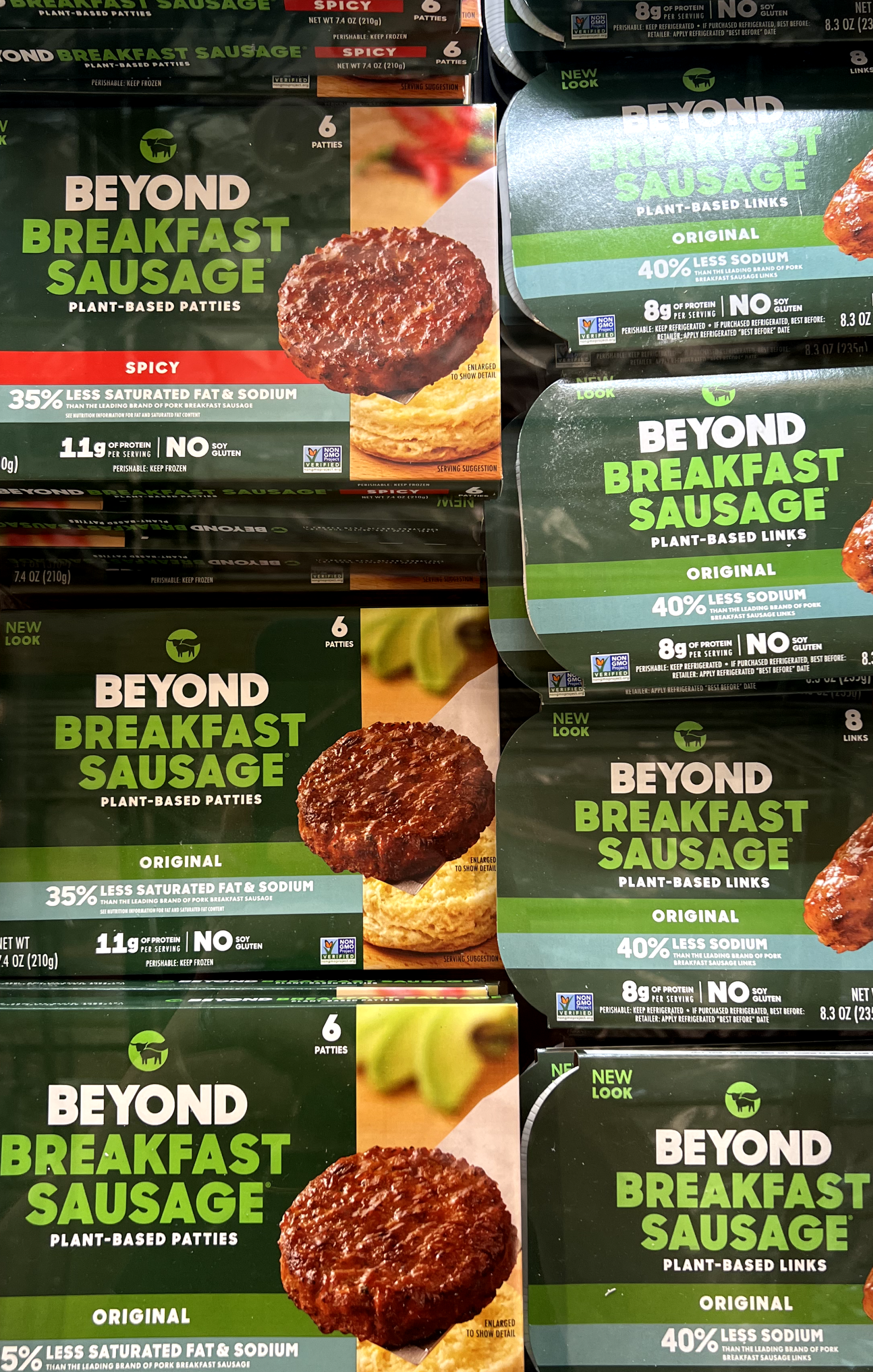
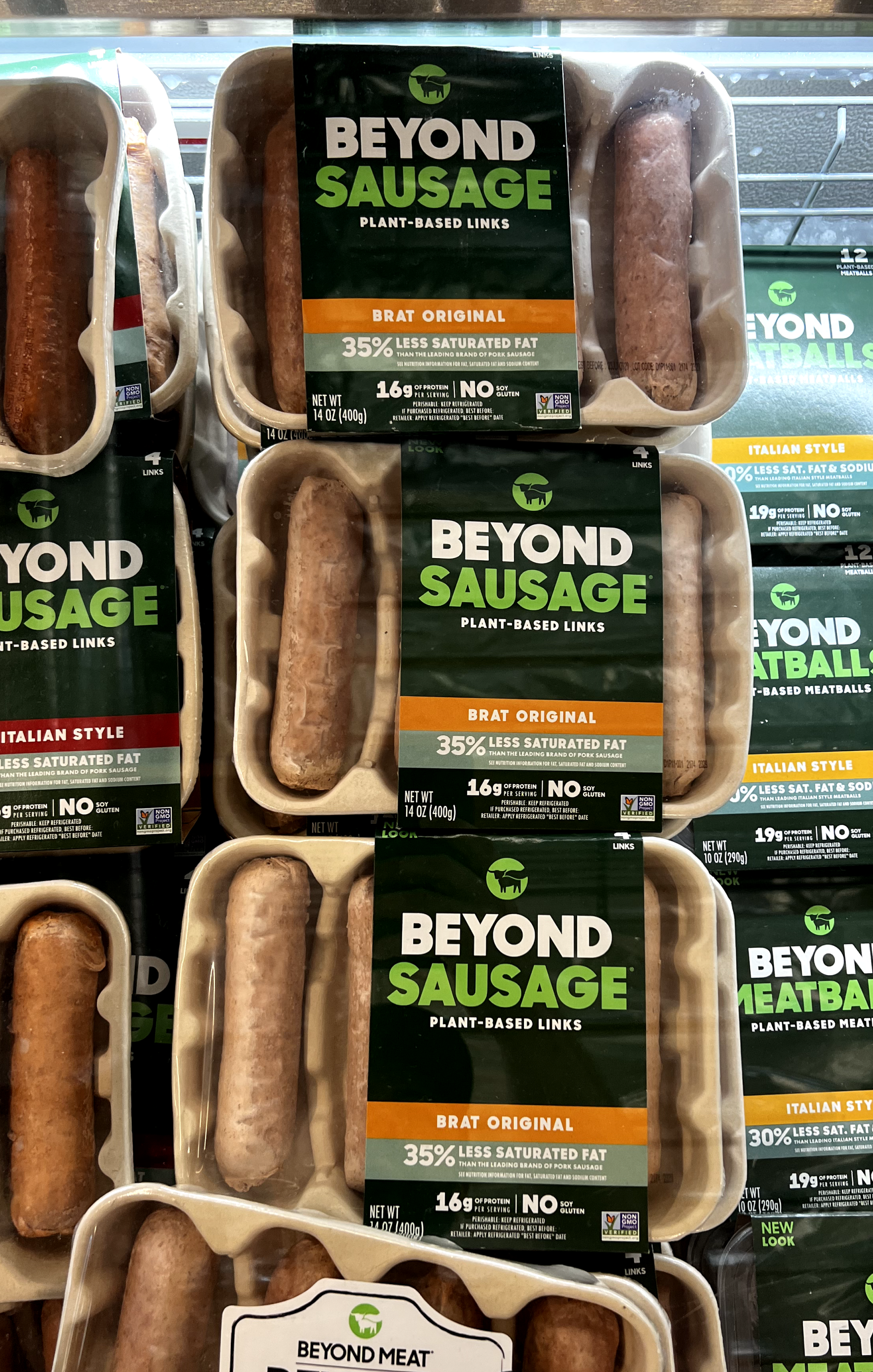
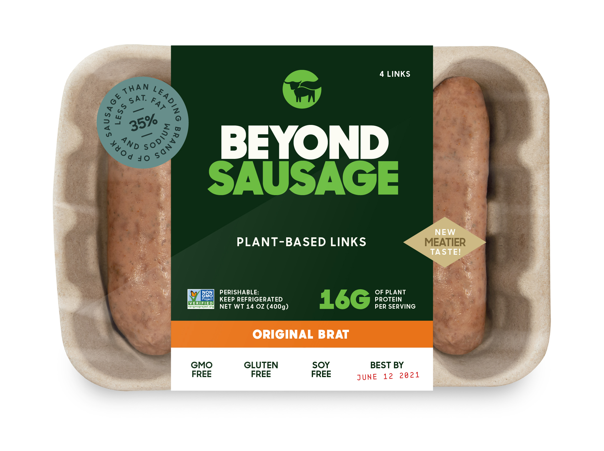
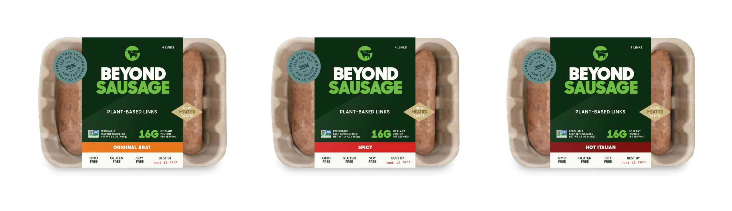
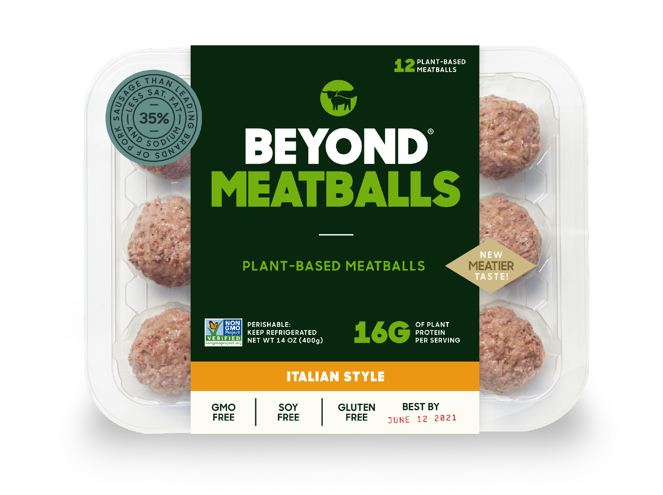
New Naming Convention
By removing the word "Meat" from the primary logo, we were able to make a typographic system that seamlessly connected the different types of products with the brand. This simple design decision became a foundational building block that solved a number of consistency issues faced in Beyond Meats' expansive product line.

Old
New
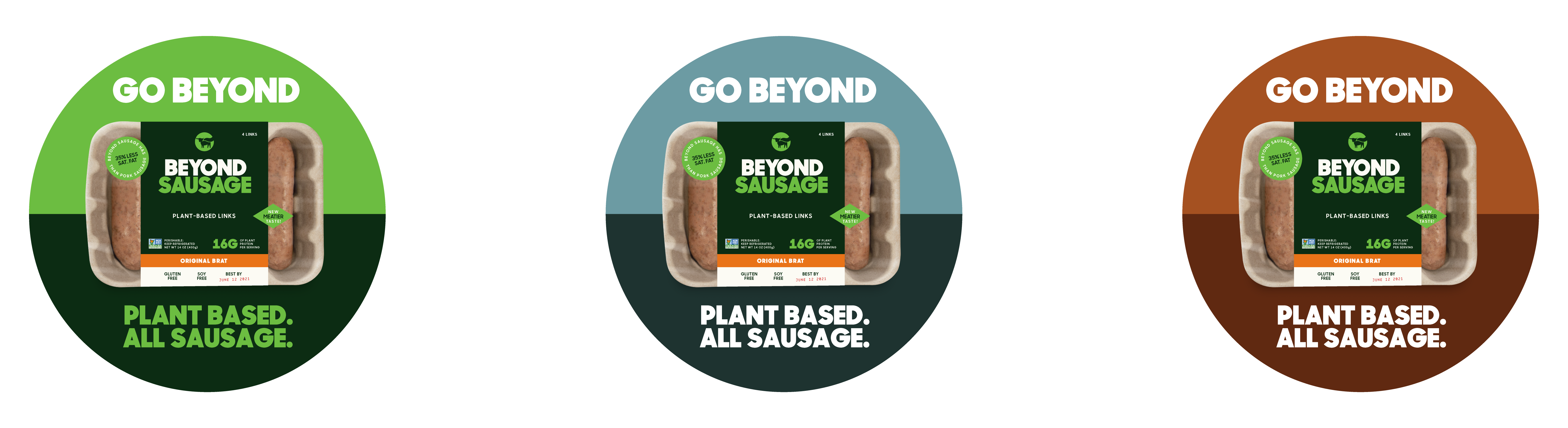
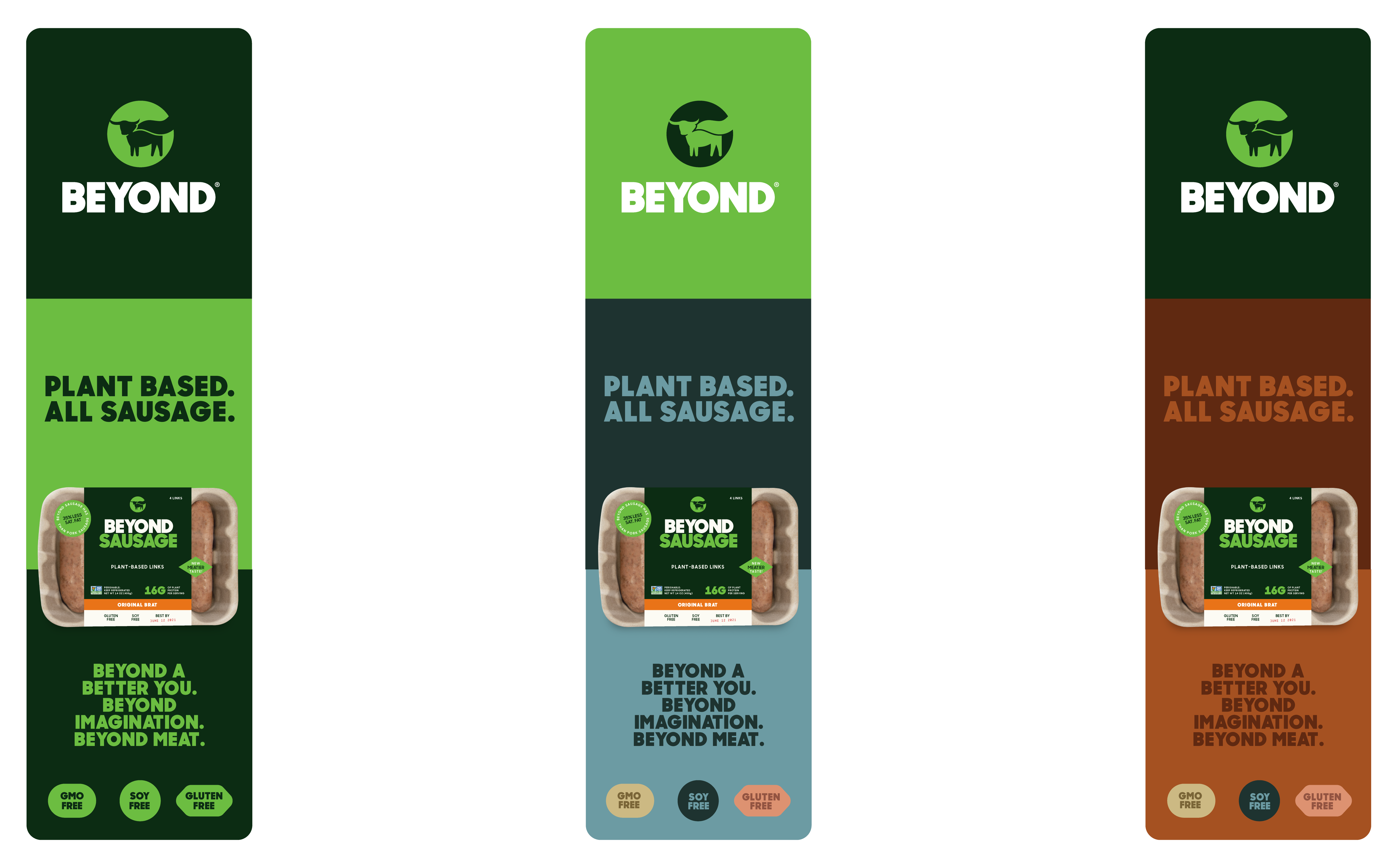
Color Palette
A defining characteristic of the new look & feel was the decision to own the color green. In addition to to revisiting the primary color palette, we defined secondary colors that could support or prop up the brand. The tertiary palette was specific flavor expression.
Color Palette
A defining characteristic of the new look & feel was the decision to own the color green. In addition to to revisiting the primary color palette, we defined secondary colors that could support or prop up the brand. The tertiary palette was specific flavor expression.


SELECTED PROJECTS
Google I/O 2023art direction, web
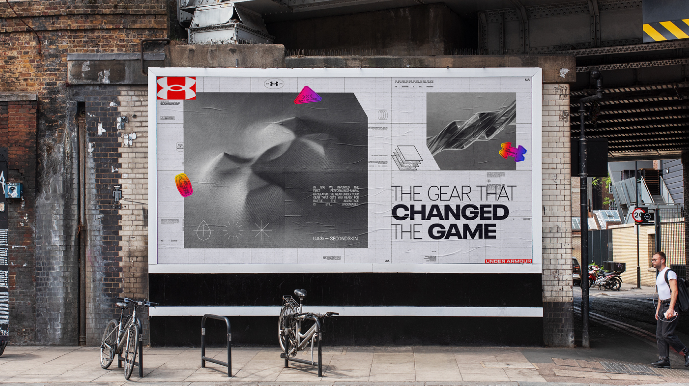
Under Armour BaselayerBranding
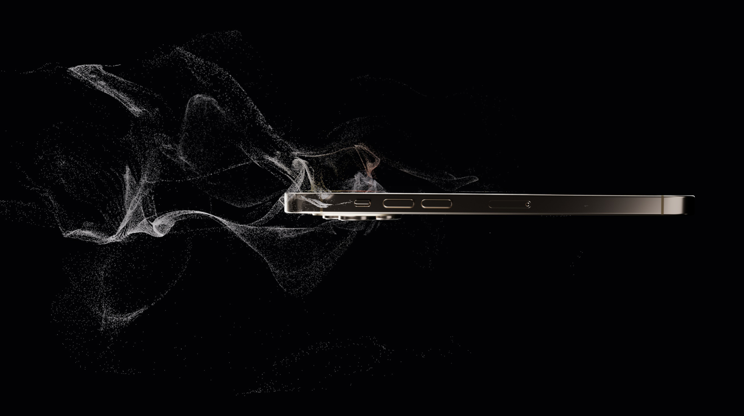
i Phone 143D, animation
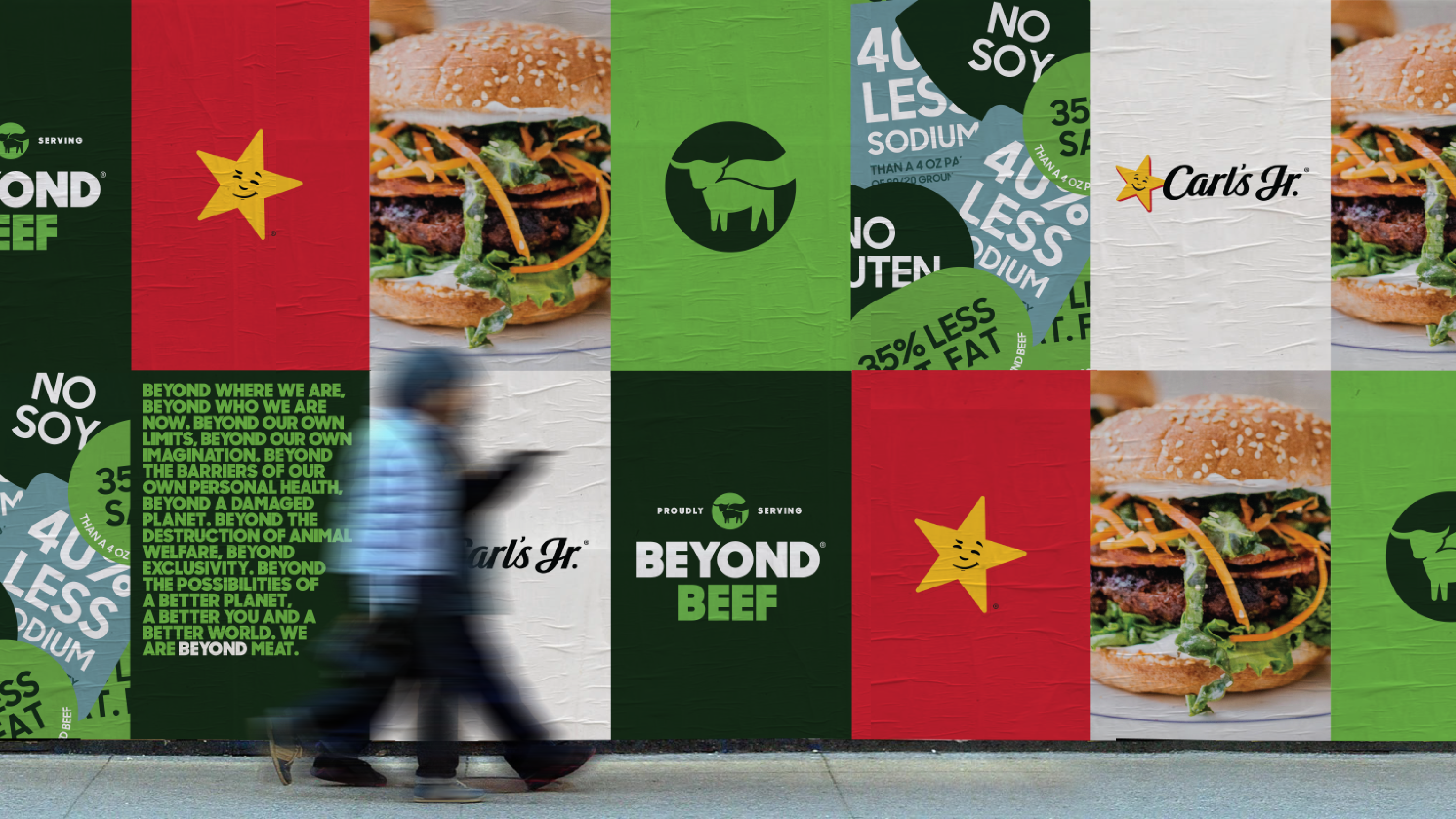
Beyond Meat Brand Refreshart direction, branding
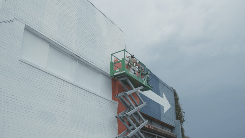
Resilience Muralenvironmental
Smithsonian 175branding, motion
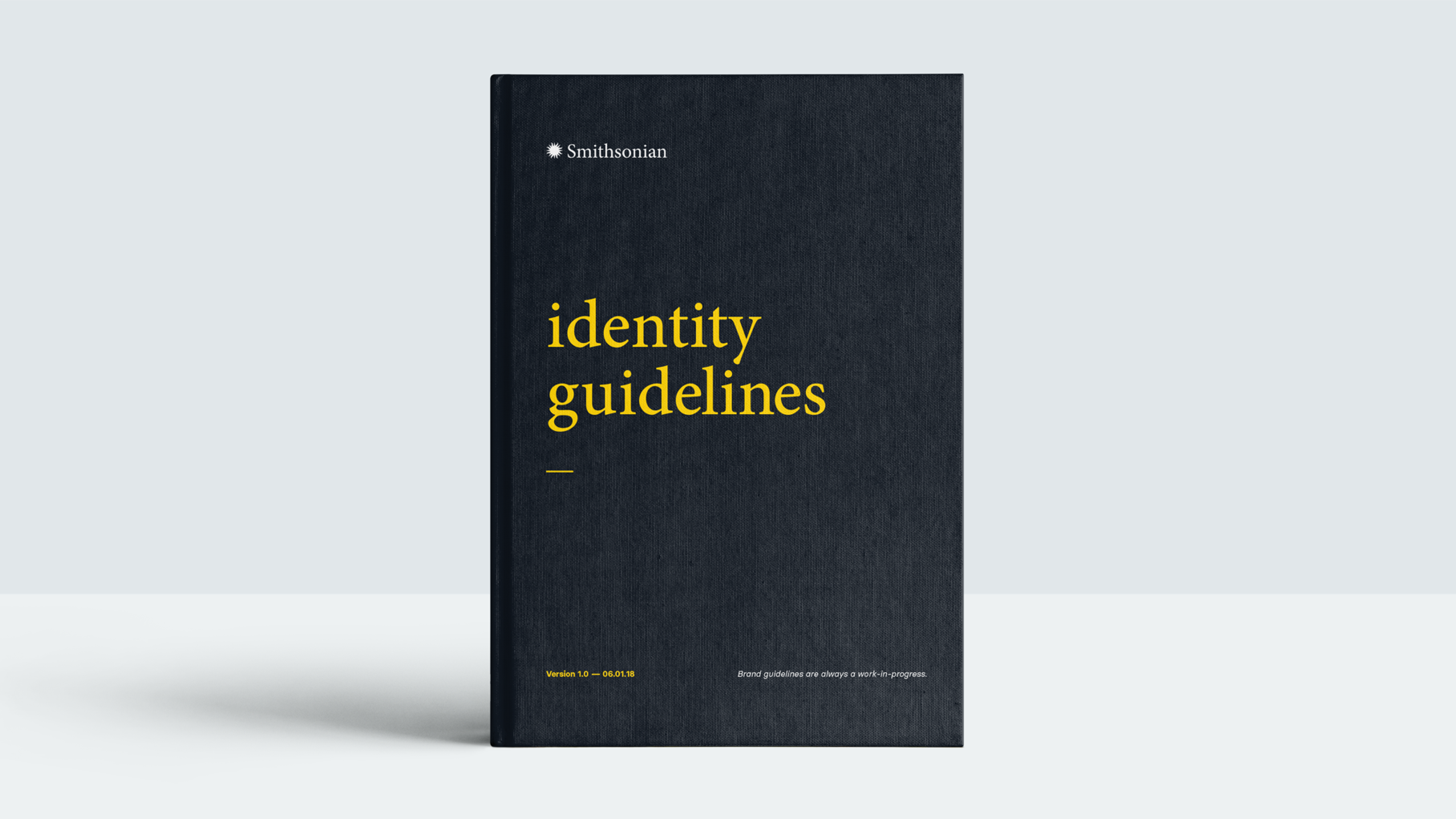
Smithsonianbrand identity, typography, web design
Spin Controlbrand identity

Extend the Cyphertypography, motion graphics
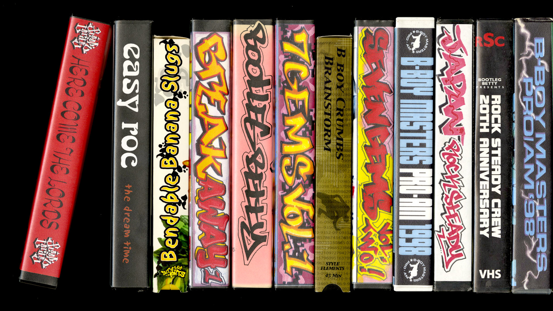
Break Tapesillustration, web design, typography
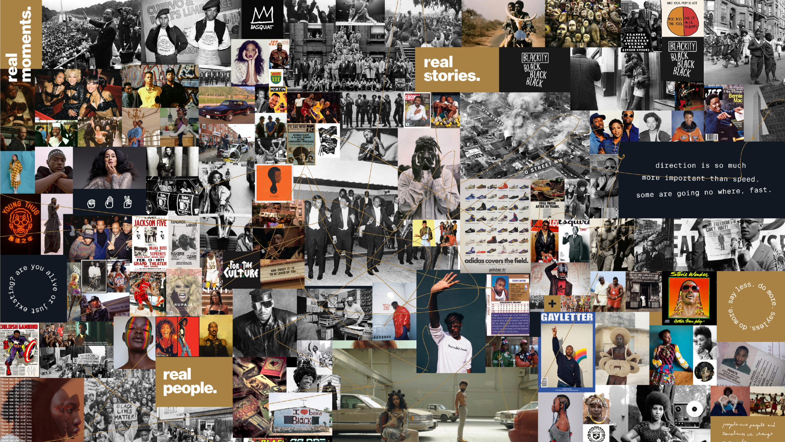
Creative Theorybrand identity, environmental, web design

Google Careers on Airbrand identity, illustration, motion graphics

Facebook Venues + Tidal + Oculusart direction

Launchbrand identity, typography
Sidedoormotion graphics, illustration, typography
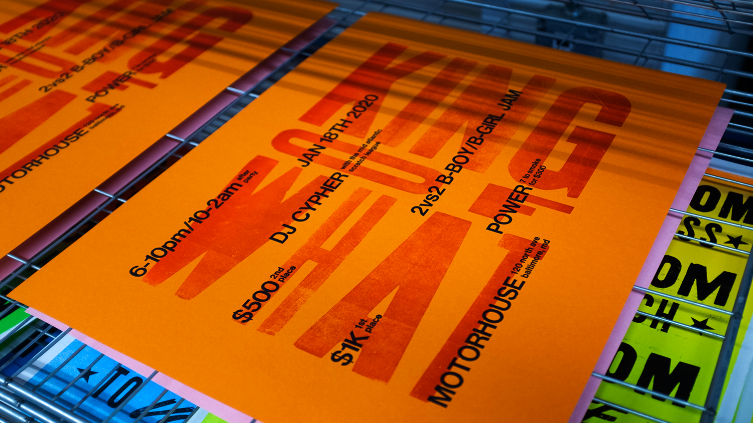
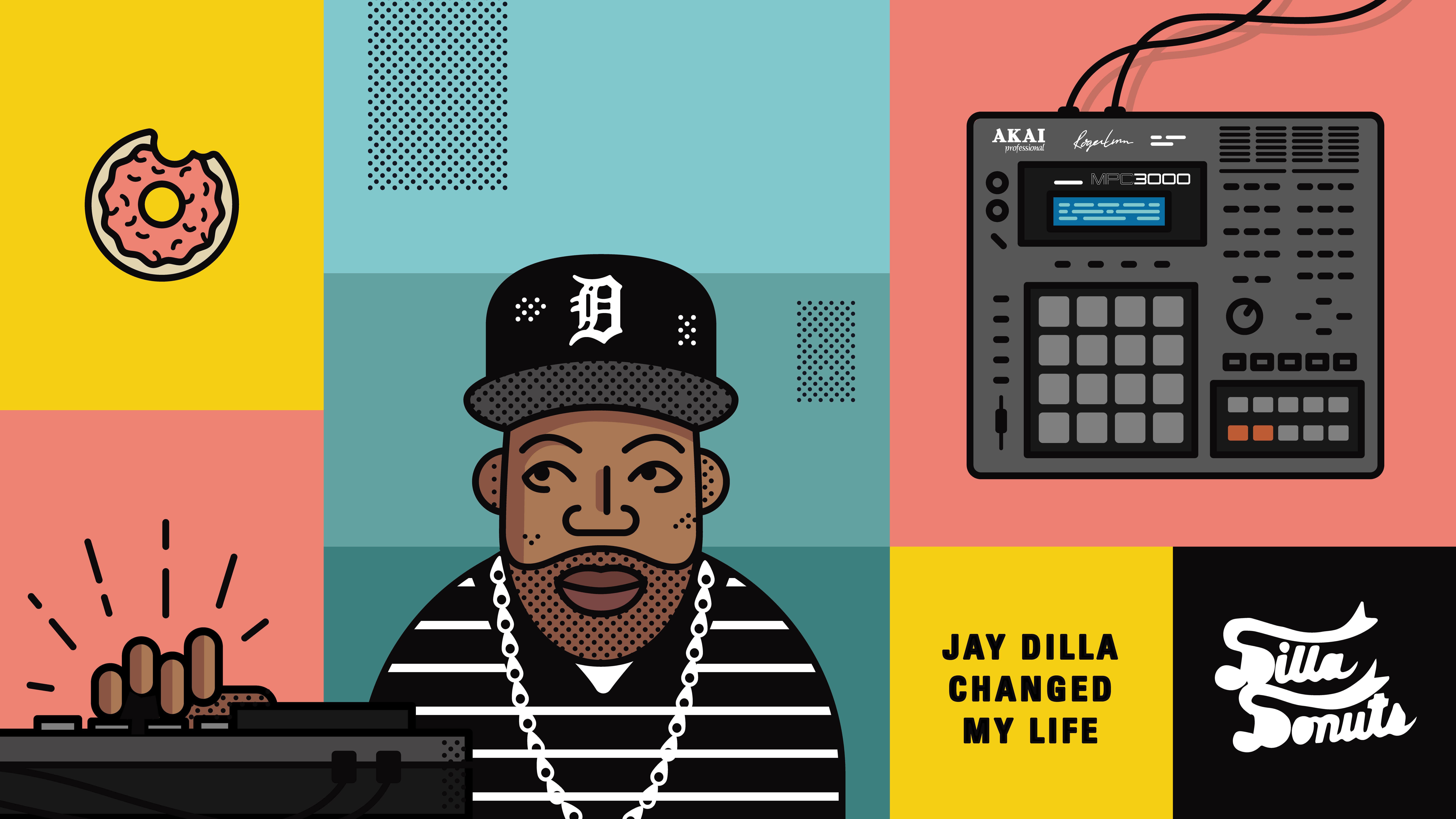
King of Whattypography
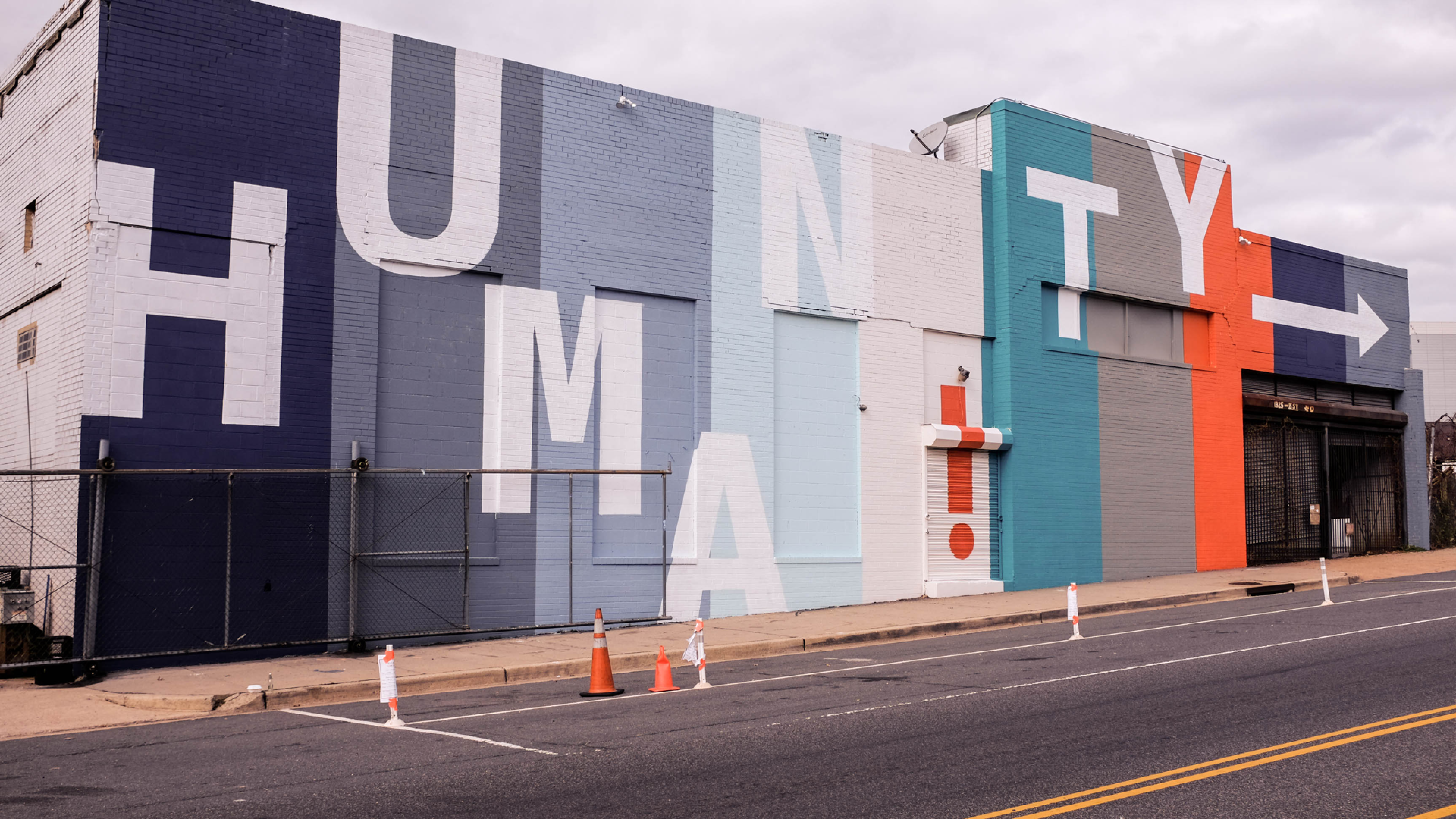
Humanity Muralenvironmental, typography
F—S
Fisk—Studio® is a tight-knit team of creative professionals dedicated to assisting businesses and agencies in crafting innovative creative solutions. Specializing in branding, 2D, 3D, AR, Web, Print, and Environmental design, we adapt and enhance ideas to meet your needs. With us, you're covered across all platforms. Our goal is to collaborate with like-minded people to produce the best work of our lives.
Fisk Studio® is the Los Angeles-based design practice of Greg Fisk specializing in art direction, animation, branding, web, 3D, and experiential design.
Fisk Studio® is the Los Angeles-based design practice of Greg Fisk specializing in art direction, animation, branding, web, 3D, and experiential design.
Fisk—Studio® is a tight-knit team of creative professionals dedicated to assisting businesses and agencies in crafting innovative creative solutions. Specializing in 2D, 3D, Web, Print, and Environmental design, we adapt and enhance ideas to meet your needs. With us, you're covered across all platforms. Our goal is to collaborate with like-minded individuals to produce the best work of our lives.
For inquiries and information
© 2024 Fisk Studio